
As we enter 2023, a new set of interior design color palettes is changing homes worldwide. Did you know a good color scheme can boost a home’s value by up to 5%? This shows how crucial picking the right colors for your home interior is.
We’re thrilled to share our favorite home interior color schemes for 2023. Our guide covers everything from classic choices to the newest trends. It’s packed with the most exciting interior design color palettes for this year.
Key Takeaways
- Discover the top interior design color palettes for 2023.
- Learn how to choose the perfect color scheme for your space.
- Explore expert tips on combining colors for a harmonious interior.
- Find out how different colors can affect the ambiance of your home.
- Get inspired by the latest trends in home interior color schemes.
The Importance of Choosing the Right Color Scheme
A well-designed color scheme is more than just colors; it’s an experience that shapes your home’s atmosphere. The colors you choose can greatly affect your mood, perception, and well-being.
How Color Affects Mood and Perception
Colors deeply impact our emotions and change a room’s ambiance. For example, calming colors like light blue or pale green can make a room feel serene. They’re great for bedrooms or meditation rooms.
Vibrant colors like orange or yellow boost creativity and energy. They’re perfect for living areas or home offices.
The way we see space is also affected by color. Lighter colors make rooms seem bigger, while darker colors create a cozy feel. It’s key to pick colors that look good and work well in your space.
Psychological Effects of Colors in Home Decor
The psychological effects of colors in home decor are complex. Different colors can trigger different emotions. For instance, blues and greens calm us, while reds and oranges energize us.
Blue, for example, is often linked with tranquility and trust. It’s a favorite for bedrooms and bathrooms.
When picking a color scheme, think about how colors affect you and your family. Choose colors that create the mood and atmosphere you want. This way, you can make your home both beautiful and good for your health.
Popular Color Trends for 2023
This year, home interior color trends are changing. We’re seeing a mix of subtle and bold colors. People are trying new hues and combinations to change the feel of a room.
Neutrals with a Twist
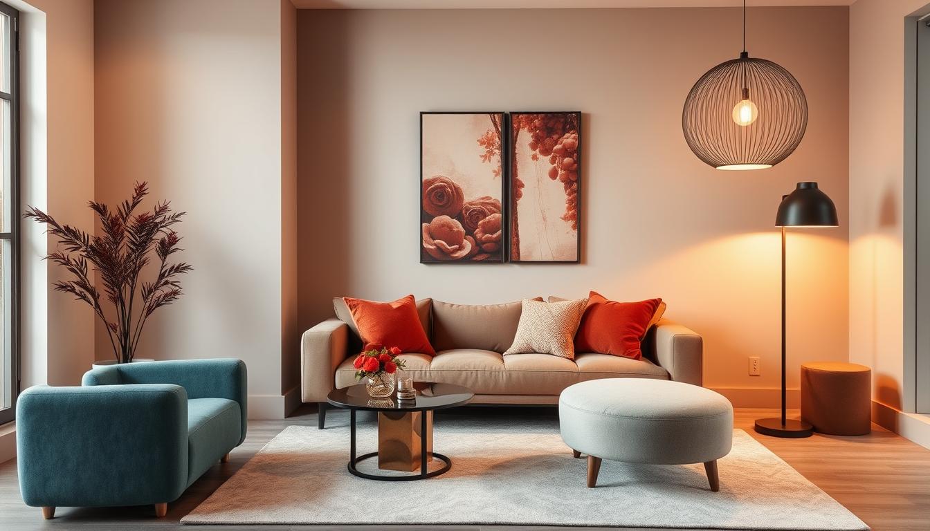
Neutral colors are still popular, but they’re getting a new twist. Designers are moving away from plain beige or white. Now, they’re using colors like taupe, soft sage, and warm terracotta.
These colors offer a calm background and add depth and style to any room.
- Taupe: A versatile, earthy tone that works well in both modern and traditional settings.
- Soft Sage: A gentle, muted green that brings a sense of calm and serenity to spaces.
- Warm Terracotta: Adds a cozy, inviting feel, perfect for creating warm and welcoming environments.
Bold Colors for Impact
Bold colors are also big in 2023. Colors like emerald green, navy blue, and rich mustard are used to make a statement. They’re used for accent walls or furniture to grab attention and start conversations.
“The right bold color can transform a room, turning it into a dynamic and engaging space.” – Interior Design Expert
Here are ways to add bold colors to your decor:
- Accent Walls: Paint one wall in a bold color to create a focal point.
- Furniture: Choose statement furniture pieces in bold, vibrant colors.
- Accessories: Use accessories like throw pillows, rugs, and curtains to add pops of color.
Creating a Cohesive Look Throughout Your Home
To make your home look cohesive, think about how colors move from room to room. A good color scheme can make your home feel more connected and open. We’ll show you how to smoothly transition colors and share tips for matching colors in different areas.
Color Flow from Room to Room
Color flow is about how colors connect from one room to another. To get a smooth flow, pick a unifying color that links rooms. This could be a main color or a secondary shade that pops up in various spots. For example, using the same blue in the living room and bedroom can tie them together.
Another way is to use a color family in rooms. Say you pick different shades of neutral tones like beige, taupe, and cream. This creates a flow that’s both varied and unified.
Tips for Coordinating Colors Across Spaces
Coordinating colors across spaces needs some planning. Here are a few tips for a cohesive look:
- Begin with a color palette you love and use it as your base.
- Play with different shades of the same color for variety.
- Remember the 60-30-10 rule: 60% main color, 30% secondary, and 10% accent.
- Think about your home’s natural flow and how colors appear as you move.
By using these strategies, you can create a stunning, unified interior. Our aim is to guide you to the best color combinations for home interiors that show off your style.
Color Schemes for Small Spaces
Living in small homes or apartments means choosing the right colors is key. The right colors can make a room feel bigger and more inviting. The wrong ones can make it feel tight and stuffy.
Light Colors to Enhance Perception of Space
Light colors on walls, ceilings, and floors can make a small space look bigger. Light colors reflect light, making the area feel more open. White, cream, and pale gray are great for small rooms as they help everything flow together.
Interior design experts say, “A single light color in a small space creates cohesion and makes it feel larger.”
“A monochromatic color scheme in light shades can visually expand a small room.”
- Soft whites and creams
- Pale grays and blues
- Mint greens and pastel shades
Creative Use of Accent Colors in Small Rooms
Light colors make a room feel bigger, but accent colors add personality and depth. It’s important to use accent colors wisely to avoid clutter. A bold accent wall or colorful accessories like throw pillows and rugs can add a pop of color.
| Accent Color | Effect |
|---|---|
| Deep Blues | Adds a sense of calm and sophistication |
| Vibrant Yellows | Creates a cheerful and uplifting atmosphere |
| Rich Greens | Bring a natural and refreshing feel |
When picking accent colors, follow the 60-30-10 rule. 60% of the room should be a dominant color, 30% a secondary color, and 10% an accent color. This balance keeps the space harmonious and prevents it from feeling too busy.

Incorporating Textures with Color
Textures are key to making your color palette pop. Mixing different textures with your colors adds depth and interest. This makes your space more inviting and lively.
The Role of Fabrics in Color Scheme
Fabrics are a big deal in interior design. They come in many textures that can match or contrast with your interior design color palettes. For example, soft linen or luxurious velvet can change the feel of a room.
When picking fabrics, think about how they work with your colors. A busy patterned fabric can add excitement, but it must fit with the color scheme. A solid-colored fabric, on the other hand, can be a clean base for other patterns.
Using Textures to Add Depth to Color
Mixing textures can really bring out the best in your color scheme. Combining smooth and rough textures creates a nice contrast. For instance, a smooth wall with a rough rug can make a room feel layered.
Wood, metal, and glass also add to the texture mix. A wooden coffee table can warm up a space, while metal accents can bring a modern touch. By carefully combining these, you can create a space that’s rich and full of life, showing off your trending home decor colors beautifully.
Seasonal Color Inspirations
Every season brings a chance to refresh your home with new colors. As we move through the year, our homes can look new again. This is done by using colors that match the season in our decor.

Spring Pastels for Freshness
Spring is the best time for soft pastel colors in your home. These colors bring freshness and calm. You can use them in decorative accessories or accent walls to make your space feel serene.
- Soft pink for a romantic touch
- Mint green for a refreshing feel
- Light blue for a serene ambiance
Warm Autumn Hues for a Cozy Feel
When autumn comes, warm colors make your home cozy. Colors like terracotta, golden yellow, and deep orange welcome you. Use these in furniture, rugs, and decor to warm up your space.
- Terracotta for a warm, earthy feel
- Golden yellow for a sunny disposition
- Deep orange for a vibrant accent
Using seasonal colors keeps your home looking fresh and modern. Whether you love spring’s soft colors or autumn’s warmth, there’s a color scheme for everyone.
Choosing Colors Based on Your Home Style
Your home’s style is key to a beautiful color scheme. The style of your home, whether traditional, modern, or a mix, affects the colors that go well with it.
Traditional Color Schemes for Classic Homes
Classic homes look great with traditional colors. These colors bring warmth and elegance. They often include:
- Rich earth tones such as terracotta and sienna
- Deep, muted colors like navy blue and emerald green
- Soft pastels for a touch of subtlety
These colors match well with the ornate details and classic furniture found in traditional homes.
Modern Color Palettes for Contemporary Spaces
Modern homes are perfect for bold and new color schemes. Modern colors often feature:
- Monochromatic schemes for a sleek, cohesive look
- Bright, bold colors to create a statement
- Neutral backgrounds with pops of vibrant color
These colors highlight the clean lines and minimal ornamentation of modern homes.
Choosing colors that match your home’s style can make it stand out. It creates a space that shows off your personal taste.
Color Pairing Suggestions
Choosing the right colors for your home is crucial. It makes your space look beautiful and welcoming. Think about how colors work together to create a nice atmosphere.
Finding the perfect color combinations can be tough. But with some guidance, you can pick colors that look great and interesting. Here are some tips to help you:
Complementary Colors for Harmony
Complementary colors are pairs that are opposite each other on the color wheel. They make your home look harmonious and appealing. For instance, blue and orange or red and green can make a big impact.
- Blue and orange: A calming blue with a vibrant orange creates a unique vibe.
- Red and green: A deep red with a soft green adds warmth and coziness.
- Yellow and purple: A bright yellow with a rich purple brings elegance and sophistication.
Contrasting Colors for Excitement
Contrasting colors use different hues to add excitement. They can highlight certain areas in your home.
- Light colors with dark colors create a dramatic look.
- Bright colors against muted backgrounds add interest.
- Try different shades of the same color for a cohesive yet dynamic look.
When picking paint colors, think about the style and feel you want. Whether you choose complementary or contrasting colors, aim for a scheme that shows your taste and enhances your home’s beauty.
Using these color pairing tips can make your home look great and feel welcoming. The right colors can really make your home stand out and make it more enjoyable.
The Role of Lighting in Color Perception
Lighting greatly affects how we see colors in our homes. It’s key to pick the right interior design color palettes. This is because lighting changes how colors look.
There are two main types of lighting: natural and artificial. Each type affects color perception differently.
Natural Light vs Artificial Light
Natural light is the best for seeing colors as they really are. It changes with the day and seasons. But, it can be hard to predict because of your home’s location and the weather.
Artificial light, though, is consistent and can be controlled. New lighting tech lets artificial light mimic natural light or match specific moods. You can choose from incandescent, fluorescent, and LED lights, each with its own color and effect.
How Lighting Changes Color Throughout the Day
The color of a room changes from morning to evening. For example, a room with north-facing windows has cooler, steadier light. But, a room with south-facing windows has warmer, more changing light.
Here’s a table showing how lighting affects color perception:
| Lighting Condition | Color Appearance | Effect on Interior |
|---|---|---|
| Natural Daytime | Colors appear vibrant and true to their hue | Enhances the overall brightness and warmth of the space |
| Artificial Warm White | Colors take on a warmer tone, with yellows and reds becoming more pronounced | Creates a cozy and inviting atmosphere |
| Artificial Cool White | Colors appear cooler, with blues and greens becoming more vibrant | Produces a calm and refreshing ambiance |
Knowing how lighting changes your home interior color schemes helps. You can choose colors that look great at any time of day.
Final Thoughts on Home Interior Color Schemes
Choosing the right colors can change your home into a cozy space that shows your style. Try out different colors to see what fits you best.
Exploring Your Creativity
Don’t shy away from new color ideas. Check out Moderno Interior for fresh inspiration and design trends.
Resources for Inspiration
Look for inspiration online, in design magazines, and on social media. These sources will help you find the perfect colors for your home. You’ll create a space you’ll adore.

