
Did you know a unified color scheme can make your space look well-designed? It’s true. Choosing the right interior color schemes can be tough. But, picking a whole house color palette makes it easier.
Choosing the perfect color combinations for your decor is key. A good color scheme can really improve your home‘s feel. By picking a consistent color palette, you can tie everything together.
Key Takeaways
- A unified color scheme creates visual harmony throughout your space.
- Establishing a whole house color palette simplifies the paint selection process.
- A well-designed color scheme can elevate the ambiance of your space.
- Choosing the right interior color schemes is crucial for a cohesive look.
- A cohesive color palette creates a sense of continuity throughout your home.
Understanding the Psychology of Color
Knowing how color psychology works is key to making your home welcoming. The colors we pick can really affect our mood and how we feel. We’ll look into how colors influence us and help you pick the best ones for each room.
How Colors Affect Mood and Emotions
Colors deeply impact our feelings and mood. Warm colors like red, orange, and yellow make us feel energized and excited. For example, a bright red wall can make a living room feel cozy and inviting.
Cool colors, such as blue, green, and purple, calm us down. They’re perfect for bedrooms and bathrooms where we want to relax.
Studies show colors can change how we act and feel. For instance, offices with natural light and blue tones boost productivity and reduce eye strain. When decorating with color, think about how different colors affect people in the space.
Choosing Colors for Different Rooms
Each room in your home has its own purpose. The colors you pick should match that purpose. Bedrooms should be calm, so soft, cool colors like light blue or pale green are great. But, a home office might need colors like yellow or orange to help you focus.
When picking colors, think about the psychology of colors in interior design. This helps you choose colors that make your home both beautiful and functional. For example, a bold color like emerald green can add personality to a room without being too much.
Popular Color Associations in Interior Design
Some colors are often linked with certain feelings or moods. White is seen as clean and pure, while black is sophisticated and elegant. Knowing these associations helps you pick popular interior paint colors that match your home’s vibe.
- Red: Energy, passion, and warmth
- Blue: Calmness, trust, and serenity
- Green: Nature, harmony, and balance
- Yellow: Happiness, optimism, and sunshine
By choosing colors wisely, you can make your home not just look good but also support your well-being.
Popular Color Schemes for Home Interiors
Color schemes are key in interior design. They shape the feel and look of your home. Choosing the right colors can make your space more welcoming and cozy.
Monochromatic Schemes
A monochromatic scheme uses different shades of one color. This creates a unified and peaceful look. For example, using various blues can make your space feel calm.
To make a monochromatic scheme more interesting, mix different textures and patterns in the same color family. This adds depth without introducing new colors.
Complementary Color Combinations
Complementary colors are opposite each other on the color wheel. They add energy and excitement to your home. Pairing blue with orange or red with green can make a bold statement.
It’s important to balance complementary colors right to avoid too much. Use one color as the main shade and the other as an accent. This helps keep the look harmonious.
Analogous Color Sets
Analogous colors are next to each other on the color wheel. They create a smooth and cohesive look. A palette with shades of green, blue-green, and blue can be calming.
| Color Scheme | Description | Example |
|---|---|---|
| Monochromatic | Different shades of the same color | Various shades of blue |
| Complementary | Colors opposite each other on the color wheel | Blue and orange |
| Analogous | Colors next to each other on the color wheel | Green, blue-green, and blue |
By using these popular color schemes, you can create a beautiful and harmonious interior. It will reflect your personal style.
Neutral Color Base: The Foundation of Interior Design
Neutral colors like beige, gray, and white are key in interior design. They work well with many colors and styles. This makes it easy to create a look that’s uniquely yours.
The Timelessness of Neutrals
Neutral colors have been a mainstay in design for years. They offer a clean background for any style. Whether you want modern or traditional, neutrals help you get there.
Neutrals make rooms feel bigger and more open. Lighter neutrals are great for small spaces or low-light areas. They bring in a sense of airiness.
How to Add Depth with Shades of Gray
Neutrals can feel flat at times. That’s where gray shades come in. They add depth and interest to your space.
Try a light gray on walls and a darker gray for furniture. This creates a layered look. It adds depth and harmony to the room.
| Shade of Gray | Usage | Effect |
|---|---|---|
| Light Gray | Walls, ceilings | Creates a sense of openness |
| Medium Gray | Furniture, accents | Adds depth and visual interest |
| Dark Gray | Accents, decorative elements | Creates contrast and adds sophistication |
Using Whites and Creams Effectively
Whites and creams are also great for design. They make rooms feel bright and airy. They can also add warmth.
Think about the undertones of whites and creams. Warm ones are cozy, while cool ones are modern.
Using neutral colors in design makes your space timeless and versatile. It’s easy to update with new trends and styles.
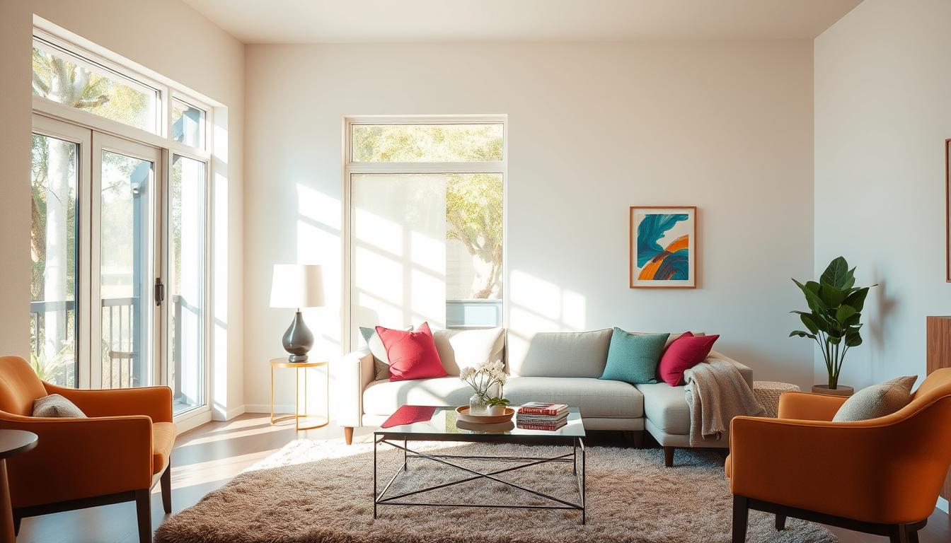
Bold Colors: Making a Statement in Your Home
Adding bold colors to your home is easy and shows off your style. These colors can make any room feel more sophisticated and personal. They make your space more inviting and unique.
Incorporating Accent Walls
Accent walls are a simple way to bring bold colors into your home. They draw the eye and add interest. Choose a bold color that complements the room’s lighting and wall colors.

Colorful Furniture and Accessories
Using colorful furniture and accessories is another great way to add bold colors. A bright armchair or a turquoise ottoman can stand out. Throw pillows, blankets, and vases in bold colors also add color and tie the room together.
Tips for Balancing Bold Colors
It’s important to balance bold colors with neutral elements. This prevents the space from feeling too busy. Here are some tips:
- Use the 60-30-10 rule: 60% neutral color, 30% secondary color, and 10% bold color.
- Balance bold colors with neutral furniture and decor.
- Consider the color wheel when selecting bold colors to ensure they complement the existing color scheme.
| Bold Color | Neutral Color | Effect |
|---|---|---|
| Deep Blue | White | Creates a striking contrast |
| Bright Yellow | Gray | Adds warmth and energy |
| Emerald Green | Beige | Brings a natural, luxurious feel |
By carefully adding bold colors to your decor, you can make your home both beautiful and personal.
Trendy Color Combinations to Watch
Interior design is always changing, and keeping up with color trends is key. This ensures your home stays stylish and modern. Certain color combos are making a big splash in home decor.
2023 Color Trends
2023 brings new color trends that will change interior design. We’re seeing colors that connect us to nature and offer comfort and calm.
Some top trends include:
- Deep Blues and Greens: These earthy tones create a soothing atmosphere.
- Soft Peach and Coral: These warm colors add elegance to any room.
- Muted Earth Tones: Terracotta, sienna, and umber are back, bringing warmth and coziness.
Pastel Palettes for a Soft Look
Pastel colors are calming and perfect for a serene home. They work well on accent walls and decorative items.
To use pastel colors in your home, follow these tips:
- Begin with a neutral base to highlight your pastel colors.
- Use pastel hues on accent pieces like throw pillows, blankets, or vases.
- For a bold look, paint one wall in a soft pastel shade.
Earthy Tones for a Natural Feel
Earthy tones bring the outdoors inside. These natural colors add warmth and depth to any room.
Popular earthy tones include:
| Color | Description | Best Used In |
|---|---|---|
| Sienna | A warm, earthy red-brown color | Living rooms, dining areas |
| Terracotta | A warm, earthy orange-red hue | Kitchens, outdoor spaces |
| Moss Green | A soft, muted green reminiscent of moss | Bedrooms, bathrooms |
Designer Kelly Wearstler said, “Color is key in design. It’s not just about looks; it’s about creating a mood.” This shows how important the right colors are for our homes.
“The right color palette can transform a space, making it feel more welcoming and comfortable.” –
Layering Colors: Textures and Patterns
To make your interior look great, it’s key to layer colors, textures, and patterns well. This adds depth and interest to a room. It makes the space feel more lively and personal.
Combining Patterns with Color
When mixing patterns with colors, pick patterns that match your color scheme. For example, a bold color like red or blue works well with neutral patterns or soft textures. This avoids making the room feel too busy. On the other hand, if your colors are calm, you can use bolder patterns to spice things up.
Tips for Combining Patterns:
- Begin with a main pattern and add secondary ones that match it.
- Keep a common color thread in all patterns for unity.
- Pair bold patterns with solid colors or soft textures for balance.
Using Textiles to Add Depth
Textiles are great for adding warmth and depth to a room. Mixing different textures and colors in throw blankets, rugs, and pillows makes a space inviting. For example, velvet, knit, or linen together add a rich feel to your room.

Balancing Different Textures and Hues
To balance textures and hues, start with a neutral base. Then, add different textures and colors. For instance, a neutral sofa can be enhanced with throw pillows in various textures and colors. This creates a balanced and attractive look.
The secret to layering is finding balance. Too many textures and colors can overwhelm a room. But too little makes it dull. Getting the balance right is essential.
Seasonal Color Combinations for Interiors
Seasonal colors can make our homes feel new again. By using colors that match the season, we can give our homes a fresh look.
Spring and Summer Color Trends
In spring and summer, we love bright colors. Green, floral patterns, and soft pastels are in style. We can add these colors with furniture, walls, or accessories.
Some trendy home colors for these seasons are:
- Soft peach and coral tones
- Mint green and aqua blues
- Sunny yellows and bright whites
Autumnal Colors for Warmth
When autumn comes, we switch to warmer colors. Terracotta, sienna, and golden brown bring warmth and depth. These colors are perfect for cozying up our homes.
To bring autumn into our homes, we can:
- Add warm-toned throw blankets and pillows
- Use rich, dark wood furniture
- Incorporate natural elements like pinecones and leaves
Winter Hues for Coziness
Winter is the time for cozy colors. Deep blues, icy greens, and snowy whites create a calm atmosphere. Adding metallics like silver or frosted glass adds luxury.
Some winter home interior color combinations ideas are:
- Navy blue and creamy whites
- Forest green and gold accents
- Soft grays and taupe tones
By using seasonal color combinations, our homes stay fresh all year.
Creating Harmony with Color Families
Combining colors in interior design can be tricky. But, knowing about color families makes it easier. By using the color wheel and mixing warm and cool tones, you can make your space look great.
The Color Wheel: Tools for Harmonizing
The color wheel is key in interior design. It shows how colors work together. It has primary, secondary, and tertiary colors for creating nice color schemes.
For example, colors opposite each other on the wheel are called complementary. They make a bold contrast.
Using the color wheel well means following the 60-30-10 rule. This means 60% of a main color, 30% of a secondary color, and 10% of an accent color. This rule helps make a balanced look that’s not too much or too little.
Finding Balance with Warm and Cool Colors
Warm colors like reds, oranges, and yellows bring energy. Cool colors, such as blues, greens, and purples, calm the space. It’s important to balance these for a nice look.
Designer Jonathan Adler said, “Color is a very powerful tool, and it’s also very personal.” Mixing warm and cool colors lets you make your space personal while keeping it balanced.
- Start with a neutral base to provide flexibility.
- Add warm or cool colors through furniture and accessories.
- Use the color wheel to find harmonious color combinations.
By understanding and using these tips, you can make a welcoming and stylish interior that shows off your taste.
Choosing the Right Colors for Small Spaces
The secret to making small spaces look bigger is choosing the right colors. Light colors make rooms appear larger. Strategic dark accents add depth and interest.
Light Colors to Make Spaces Feel Larger
Light colors on walls and ceilings make rooms feel bigger. White, cream, and light gray are great for small spaces. They reflect light and make rooms feel open. Interior design experts say, “A light color palette can make a small room feel larger.”
“A fresh coat of light paint can make a small room feel larger and more welcoming.”
Strategic Dark Accents for Depth
Light colors make spaces feel larger, but dark accents add depth. Use dark colors in furniture, rugs, or accent walls. A dark accent wall can be a focal point, drawing the eye away from the room’s size.
- Use dark colors sparingly to avoid overwhelming the space.
- Balance dark accents with lighter shades to maintain harmony.
- Consider the 60-30-10 rule: 60% light color, 30% secondary color, and 10% accent color.
Clever Use of Mirrors and Light
Mirrors and lighting also play a big role in making small spaces look bigger. Mirrors reflect light and images, making rooms seem larger. Placing mirrors opposite windows can also make rooms brighter and more spacious.
By using the right colors, mirrors, and light, you can make small spaces feel bigger and more welcoming. We’ll explore more decorating ideas in the next sections.
Mixing and Matching: A Guide to Eclectic Interiors
Mixing styles and colors can make your home decor truly unique. Eclectic interiors celebrate diversity and fun. But, it’s key to balance styles and colors for a harmonious space.
Combining Different Styles and Colors
Start with a common element, like a color or texture, to tie the room together. Use a neutral base and add color with furniture and accessories. This way, you can mix modern and vintage styles smoothly.
The 60-30-10 rule is helpful for balance. 60% of the room is a dominant color, 30% a secondary, and 10% an accent. This rule ensures a harmonious look. For example, a bohemian look can be balanced with this rule.
The Art of Color Cohesion
Color cohesion is key in eclectic interiors. Choose core colors and use them throughout. Different shades of the same color add depth and interest. For instance, various blues can create a soothing look.
Use a unifying element, like a rug or artwork, that ties colors together. This creates a cohesive feel in the space.
Tips for a Unified Look
For a unified look, have a clear vision or theme. It’s not about matching everything, but finding a common thread. Focus on a color scheme or similar textures and materials.
- Start with a neutral base for a calm background.
- Use a consistent color palette to tie the room together.
- Add different textures and patterns for depth and interest.
- Mix high and low pieces for a unique look.
- Regularly edit your space to keep it balanced.
By mixing and matching, you can create a beautiful, eclectic interior. Whether using best interior color combinations or bold new hues, have fun and be creative.
Sustainable and Timeless Color Choices
Choosing paint colors for your home can greatly impact its beauty and the environment. Opting for sustainable and timeless colors creates a welcoming atmosphere. These choices also support the planet. By picking eco-friendly paints and timeless colors, we make our homes both beautiful and green.
Eco-Friendly Options for a Greener Home
More people are choosing eco-friendly paints to reduce their environmental impact. Brands like Benjamin Moore and Sherwin-Williams offer low-VOC paints. These paints are good for the planet and improve indoor air quality. By picking these colors, we can make our homes stylish and sustainable.
Timeless Colors for a Lasting Impression
While trendy colors are tempting, timeless colors are key for a lasting look. Neutral shades, like those from Valspar, are always in style. They add versatility and beauty to any room. Choosing these colors ensures our homes stay stylish for years.
The Power of Versatile Palette Selections
A well-chosen color palette is crucial for a cohesive look. Mixing complementary colors adds depth and interest. Whether you prefer bold colors or soft pastels, the right palette reflects your style and complements your home.

