
Did you know the right color palette can boost your home’s value by up to 5%? With interior design color trends always changing, it’s key to stay updated. This helps you make the most of your space.
We’ll show you how to pick the perfect palette to change your space. By learning about color theory and checking out current trends, you’ll find a scheme that matches your style.
Key Takeaways
- Understand the impact of color on your space’s value
- Learn the basics of color theory for informed decisions
- Explore popular interior design color trends
- Discover how to choose a palette that suits your style
- Get tips on applying color combinations effectively
Understanding the Basics of Color Theory
To make your home welcoming, you need to know color theory basics. It’s about mixing colors in a way that looks good together. This is key in interior design, as it changes how a room feels.
What is Color Theory?
Color theory mixes art, design, and psychology. It studies how colors affect us. It looks at color properties like hue, saturation, and value to create different moods in a space.
The Color Wheel Explained
The color wheel shows how colors are related. It’s a basic tool for designers and homeowners. It helps understand primary and secondary colors, and how to mix them for harmony. The wheel has 12 sections, covering primary, secondary, and tertiary colors.
| Color Type | Description | Examples |
|---|---|---|
| Primary Colors | Basic colors that cannot be created by mixing other colors. | Red, Yellow, Blue |
| Secondary Colors | Colors created by mixing two primary colors. | Orange (Red + Yellow), Green (Blue + Yellow), Violet (Blue + Red) |
| Tertiary Colors | Colors created by mixing a primary color with a secondary color. | Yellow-Green, Blue-Green, Red-Orange |
Warm vs. Cool Colors
Colors can feel warm or cool. Warm colors like red, orange, and yellow make us feel energetic. Cool colors, such as blue, green, and violet, calm us down. Knowing this helps create a balanced color scheme. For more on choosing colors, check out our guide on Modern Interior.
“The right color palette can transform a room, making it feel more spacious, cozy, or vibrant, depending on your goals.” – Interior Design Expert
Learning about color theory helps you pick colors that match your style. It’s about understanding the color wheel and warm vs. cool colors.
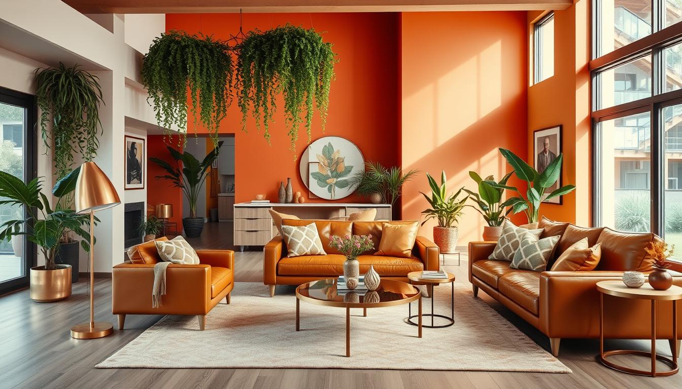
Popular Color Combinations for Living Rooms
The living room is the heart of any home. Choosing the perfect color palette is key to making it cozy and inviting. In the living room, you can experiment with different color combinations to create a unique atmosphere.
Neutral and Earthy Tones
Neutral and earthy tones are popular for living rooms. They create a calm and serene environment. Shades like beige, taupe, and soft gray make a room feel spacious and relaxing.
These colors also provide a versatile backdrop. You can add pops of color through furniture and decor.
Bold Accents with Pastels
For a playful take, pair bold accents with pastel colors. Soft pastel shades add whimsy. Bold accents in complementary colors create visual interest.
This combination works well in modern or eclectic decor styles.
Monochromatic Schemes
A monochromatic color scheme uses different shades of the same color. It creates a cohesive look. For example, various shades of blue can create a dramatic and soothing atmosphere.
| Color Scheme | Description | Ideal For |
|---|---|---|
| Neutral and Earthy | Beige, taupe, soft gray | Calm, spacious feel |
| Bold Accents with Pastels | Pastel shades with bold accents | Modern, eclectic styles |
| Monochromatic | Different shades of one color | Sophisticated, harmonious look |
When choosing a color combination for your living room, think about the style and atmosphere you want. Whether you choose popular paint colors for home interiors like soft grays or bold blues, pick a palette that reflects your taste. It should make the space feel welcoming.
Color Palettes for Bedrooms
Bedrooms need a color scheme that helps you relax and feel refreshed. The right colors can turn your bedroom into a cozy retreat. This can improve your sleep and overall health. Let’s look at different color palettes that can make your bedroom calm.
Soft and Serene Shades
Soft and serene shades are great for a calming bedroom. Light blue, pale green, and creamy whites can make your bedroom feel like a peaceful oasis. These colors are soothing and help reflect light, making the room seem bigger.
For example, a mix of soft blues and whites can remind you of a clear sky or a calm sea. Pale greens can bring nature indoors, helping you relax.
Dark and Cozy Options
Dark and rich colors can create a cozy atmosphere. Deep blues, charcoal grays, and warm browns make your bedroom snug and intimate. These colors also hide wall imperfections.
Dark colors can be balanced with lighter accents to avoid feeling too dark. For instance, deep blue walls with white bedding and curtains create a striking contrast.
Adding Accent Colors
Accent colors add depth and personality to your bedroom. You can use a bold hue through throw pillows, furniture, or an accent wall. The right accent color can make the room stand out.
When picking an accent color, use the 60-30-10 rule. 60% of the room should be a main color, 30% a secondary color, and 10% an accent color. This balance prevents the room from feeling too busy.
| Color Palette | Description | Accent Color |
|---|---|---|
| Soft Blue and White | Calming and serene, perfect for a coastal vibe | Corals or yellows |
| Deep Gray and Cream | Modern and sophisticated, ideal for a minimalist look | Bright red or orange |
| Pale Green and Wood Tones | Nature-inspired, great for a rustic or country feel | Earth tones or gold |
Choosing the right color palette for your bedroom is key to creating a restful space. By using soft and serene shades, dark and cozy options, and adding accent colors, you can make a bedroom that reflects your style and improves sleep.
Kitchen Color Ideas for a Modern Look
The color of your kitchen is key to a modern and welcoming feel. The kitchen is often seen as the heart of the home. Its colors greatly affect the look and feel of the space.
Classic White with Bold Accents
A classic white kitchen is clean and timeless. Adding bolder accents through accessories can make it pop. This mix of white and bold colors makes for a modern and eye-catching look.
Warm Wood Tones
Warm wood tones add coziness and natural charm to kitchens. Wooden cabinets, flooring, or even a wooden island can warm up the space. Paired with modern appliances and sleek countertops, they create a welcoming kitchen.
Bright and Cheerful Combinations
Bright and cheerful colors can make a kitchen lively and energetic. Colors like sunny yellow, sky blue, or lime green work well in backsplashes, utensils, or wall paint. These colors brighten the mood and make the kitchen feel modern and lively.
Choosing the right kitchen color scheme is important. It should match your home’s style and theme. By using current color trends, your kitchen will be modern and blend well with your home.
Bathroom Color Combinations for a Spa Feel
Turning your bathroom into a spa oasis is simpler than you might think. The right home color combinations interior can make all the difference. A well-chosen color palette is key to creating a peaceful space.
Choosing colors for your bathroom is all about the look you want. For a spa vibe, pick calming colors that help you relax.
Calming Blues and Greens
Blues and greens are calming, making them great for bathrooms. Soft blues remind you of the ocean, while greens think of nature. Try light blue walls with green accents for a peaceful feel.
Crisp White and Gray
For a modern look, go with white and gray. White makes your bathroom feel clean and open. Gray adds elegance. This combo is perfect for bright bathrooms.
Vibrant Tiles and Subtle Hues
To add interest, use vibrant tiles. Colors like turquoise or coral add a splash, while beige or cream balance it out. Use these tiles as an accent or border, with softer colors elsewhere.
Choosing the right home decor color palettes can make your bathroom feel like a spa. Whether you like calming colors, modern whites and grays, or bold tiles, there’s a perfect mix for you.
Choosing Colors Based on Room Size
The size of a room greatly affects the colors you should choose. When choosing colors for your home, think about how colors change a room’s feel. Different hues can make a room look bigger or cozier.
Light Colors for Small Spaces
Light colors can make small rooms seem bigger. White, cream, and pale pastels work well. They reflect light and make rooms feel open.
Using these colors on walls, ceilings, and floors creates a unified look. It makes the room feel airy.

Dark Colors for Coziness
Dark colors can make big rooms feel cozy. Blues, greens, and rich neutrals add warmth. But, use them with lighter shades to prevent a cave-like feel.
Balancing with Accent Shades
Accent shades are key to a balanced color scheme. They add interest, whether in a small or large room. A bold accent color can make your space unique.
| Room Size | Recommended Colors | Accent Shades |
|---|---|---|
| Small | Light colors (white, cream, pale pastels) | Bold and bright colors |
| Large | Dark colors (deep blues, greens, rich neutrals) | Soft and muted colors |
Choosing colors based on room size can make your space beautiful and welcoming. The secret to a great color scheme is balance and harmony.
Seasonal Color Trends for Interiors
Every season brings a chance to update your home’s colors. Refreshing your home with the latest trends keeps it looking great and feeling new.
Let’s look at the top colors for each season, starting with summer’s cool tones.
Colors for Summer Refresh
Summer calls for bright, airy colors that feel cool and calm. Soft blues, crisp whites, and pastel shades are all in. These interior design color trends make your home feel serene during the warm months.
To add these colors to your space, paint walls light blue or use white furniture with pastel touches. Adding summer decor like seashells or flowers can also enhance the season’s vibe.
Fall’s Warm and Rich Palettes
Fall brings warm, inviting colors to your home. Orange, red, and yellow are the stars of fall’s color palette. They create a cozy feel in any room.
To welcome fall, use warm wood furniture, throw blankets in autumn colors, or paint an accent wall in a deep color. These touches make your home feel welcoming for the season.
Winter Cool Tones
Winter’s interior design color trends are all about cool, calming shades. Blues, from sky to navy, and whites and silvers are popular. They make your home feel serene and peaceful.
To bring winter into your home, use blue and white ceramics, add metallic accents, or paint walls gray or blue. These elements create a winter wonderland feel.
Embracing these seasonal colors keeps your home looking fresh all year. Whether you want a big change or just a few updates, there’s a color scheme for you.
Using Patterns and Textures with Colors
Colors are just the start in interior design. Patterns and textures add depth and interest. Mixing them with your color palette creates a space that shows off your style.
Stripes and Solids
Stripes bring energy and movement to your space. Paired with solid colors, they offer a modern yet timeless look. For example, a neutral stripe wallpaper can complement solid-colored furniture beautifully.
Here’s how to mix stripes with solids:
- Use a main color for both stripes and solids.
- Try different stripe widths for variety.
- Pair bold stripes with neutral solids to avoid too much.

Floral and Geometric Patterns
Floral and geometric patterns add unique charm to your space. Florals bring elegance and warmth, while geometrics add a modern vibe. Mixing them with your colors creates a stunning, layered look.
Here are tips for mixing floral and geometric patterns:
- Start with a main pattern and add the other as an accent.
- Choose patterns that share a common color for cohesion.
- Play with different scales for interest.
Blending Textures for Depth
Textures make your space feel inviting and complex. Mixing smooth, rough, and soft textures creates a layered look. For example, a smooth leather sofa with a rough rug and soft blankets adds depth.
Here’s how to blend textures:
- Mix materials like wood, metal, and fabric for a diverse texture palette.
- Contrast textures with your color palette; matte can complement glossy.
- Balance busy textures with simpler ones for harmony.
By carefully mixing patterns, textures, and colors, you can create a home that’s visually stunning and full of character. Try different combinations to find the perfect fit for your space.
Eco-Friendly Color Choices for Sustainable Homes
Homeowners are now looking for eco-friendly colors that are stylish and sustainable. They want homes that are beautiful and good for the environment. The colors we choose are very important in this effort.
Non-Toxic Paint Options
Choosing non-toxic paints is key to eco-friendly colors. Traditional paints can pollute our air. Now, we have paints that are safer for our homes.
Some popular non-toxic paint brands include:
- Benjamin Moore’s Natura line
- Behr’s Premium Plus ULTRA
- Sherman Williams’ ProMar 200
| Brand | Product Line | VOC Level |
|---|---|---|
| Benjamin Moore | Natura | Low-VOC |
| Behr | Premium Plus ULTRA | Low-VOC |
| Sherman Williams | ProMar 200 | VOC-Free |
Nature-Inspired Color Schemes
Nature gives us beautiful color schemes. By using these colors, our homes can feel connected to the outdoors. Colors like sage green, sandy beige, and sky blue can make our homes calm and peaceful.
To use nature-inspired colors, look at the landscape outside your windows. You can also get ideas from wood, stone, and plants.
Embracing Natural Light
Using natural light is good for our homes and the planet. Lighter window treatments and mirrors can help bring more light into our homes. This means we use less artificial light.
Tips for Maximizing Natural Light:
- Use sheer curtains or blinds to let sunlight in while keeping things private.
- Place mirrors opposite windows to reflect light.
- Avoid heavy drapery that blocks sunlight.
By choosing eco-friendly colors, we can make homes that are sustainable, beautiful, and healthy. Using non-toxic paints, nature-inspired colors, and natural light helps us build a better future.
Tips for Deciding on a Color Scheme
Choosing the right color scheme for your home can seem hard. But, with a few simple tips, you can make a beautiful space. When picking colors for your home, think about a few key things. This ensures you get a look you’ll love.
Evaluating Personal Style
Your home’s colors should match your style and preferences. Start by thinking about the colors you like and dislike. Look at your favorite clothes, artwork, or decor for inspiration. This helps you understand your color preferences.
Also, check out interior design color trends for ideas. But, choose colors you love, not just what’s trendy.
Testing Colors with Samples
Once you have colors in mind, test them. Paint samples on walls and see how they look at different times. Use paint swatches or color cards for a better feel. This step is key to making sure your colors work well together and with your home’s lighting.
Working with a Color Wheel
A color wheel is a great tool for picking a color scheme. It shows how colors relate to each other. For example, it helps you find complementary colors (opposite each other) or analogous colors (next to each other).
This makes your color scheme harmonious and appealing.
To see how colors work together, let’s look at a comparison table:
| Color Scheme | Description | Example |
|---|---|---|
| Monochromatic | Using different shades of the same color | Various shades of blue |
| Complementary | Pairing colors that are opposite each other on the color wheel | Blue and orange |
| Analogous | Using colors that are next to each other on the color wheel | Blue, green, and yellow |
By following these tips and using the right tools, you can create a color scheme that enhances your home’s beauty and reflects your personal style. Remember, the key is to have fun and be creative with the process!
Final Thoughts on Home Color Combinations
Choosing the right colors for your home is a journey. It involves understanding color theory and the purpose of each room. It also means keeping up with the latest trends. By being open to change, you can make a space that shows your style and meets your needs over time.
Flexibility in Design
Being open to new ideas and trends is key. For example, using the latest interior color schemes can give your home a fresh look. Check out our favorite color trends for inspiration for your next design project.
Cohesion is Key
Keeping your design cohesive is important for a harmonious look. This means balancing patterns, textures, and colors to create a unified space. For more ideas, visit Moderno Interior for inspiration.
Staying on Trend
Our favorite color trends include bold accents, soft pastels, and monochromatic schemes. These colors can be used in different ways to keep your home looking modern and stylish.

