
Did you know the right home interior color palettes can boost your home’s value by up to 5%? The choice of color schemes for homes interior greatly affects your living space’s feel and look.
Finding the perfect color schemes can seem hard. But knowing color theory basics and how to apply them in design can help a lot. At Moderno Interior, we think the right colors can turn your home into a lively and inviting place.
Key Takeaways
- Understanding color theory is crucial for selecting the right interior colors.
- The right color scheme can significantly impact your home’s ambiance.
- Popular home interior color palettes include neutral tones and bold accents.
- Consider the natural light and furniture when choosing your color scheme.
- Test colors with samples before making a final decision.
Understanding the Basics of Color Theory
Choosing the right interior design color schemes starts with color theory basics. Color theory helps us mix colors in a way that looks good together. It shows how colors work with each other.
The color wheel is key to color theory. It’s a circle of colors that shows their connections.
The Color Wheel and Its Importance
The color wheel is vital for paint color schemes for houses. It shows how colors are linked and helps find matching colors. It helps us see primary, secondary, and tertiary colors. This way, we can mix them to get the look we want.
Primary, Secondary, and Tertiary Colors
Primary colors are red, blue, and yellow. You can’t make them by mixing other colors.
- Red is bold and energetic, great as an accent.
- Blue is calming, perfect for bedrooms.
- Yellow is bright and cheerful, great for kitchens and dining.
Secondary colors come from mixing two primary colors. They are:
- Green (blue + yellow), refreshing and balancing.
- Orange (red + yellow), vibrant and energetic.
- Purple (blue + red), luxurious and creative.
Tertiary colors are made by mixing a primary color with a secondary one. This creates six colors: yellow-green, blue-green, blue-violet, red-violet, red-orange, and yellow-orange.
| Color Type | Colors | Description |
|---|---|---|
| Primary | Red, Blue, Yellow | Basic colors that can’t be made by mixing |
| Secondary | Green, Orange, Purple | Colors made by mixing two primary colors |
| Tertiary | Yellow-Green, Blue-Green, Blue-Violet, Red-Violet, Red-Orange, Yellow-Orange | Colors made by mixing primary and secondary colors |
Knowing these color types is key for good interior design color schemes and paint color schemes for houses. By understanding color mixing, we can create beautiful spaces that show our style.
Choosing the Right Color Scheme for Your Space
Choosing a color scheme that fits your lifestyle and style is key to a harmonious home. Interior design involves many elements to create a beautiful and useful home.
When picking a color scheme, several things matter. Experts say a good color scheme can make a room feel welcoming and cozy.
“Color is a crucial element in interior design, as it has the power to influence our emotions and perceptions.”
Factors to Consider
The room’s purpose is a big factor. Different rooms need different colors. For example, a bedroom should be calm, while a home office should be lively.
Other things to think about are the room’s lighting, furniture, and style. Knowing color theory basics helps make good color choices.
The Role of Room Functionality
The room’s function is key in choosing colors. A kitchen might need bold colors, while a living room should be calmer.
Some popular interior color combinations include:
- Monochromatic schemes for a cohesive look
- Complementary colors for a bold statement
- Analogous colors for a harmonious palette
By thinking about these factors, you can pick a color scheme that looks good and works well in your space.
Popular Interior Color Scheme Trends
The world of interior design is always changing. One key way to update our homes is by using the latest color schemes. It’s important to pick colors that make our spaces look better and feel right.
Monochromatic Color Schemes
A monochromatic color scheme uses different shades of the same color. This makes a room look bigger and feel calm. For example, using different blues can make a room very soothing.
Complementary Color Schemes
Complementary color schemes pair colors that are opposite each other on the color wheel. This adds energy and interest to a room. But, it’s important to use these colors carefully to avoid too much.
Analogous Color Schemes
An analogous color scheme uses colors next to each other on the color wheel. This creates a smooth look and makes a room feel connected. Using different greens and blues can make a room feel calm and natural.
By using these color trends, we can make our homes stylish and personal. Whether we choose monochromatic, complementary, or analogous colors, the goal is to make our homes look great.
Creating Mood with Color in Our Homes
The colors we pick for our homes greatly affect the mood and feel of our spaces. By knowing how colors impact our emotions and energy, we can choose the right colors for our homes. This helps us create the perfect atmosphere.
Colors can change how we feel, work, and feel overall. When picking colors for our homes, thinking about their psychological effects is key. Let’s see how colors can make our homes calm or lively.
Calming Colors for Serenity
For places like bedrooms and bathrooms, calming colors are best. Light blues and sky blues are soothing. Soft greens, like sage or moss, also bring a peaceful feel, like being in nature.
Soft, muted colors can lower stress and help us sleep better. Use these colors on walls, bedding, and curtains for a peaceful spot. Neutral tones like beige, cream, and pale gray also add to calmness by keeping things clean and simple.
Energizing Colors for Activity
For active areas like home gyms, playrooms, or kitchens, bright colors work well. Orange, red, and bright yellow boost energy and excitement. Use these colors as accent walls or in furniture and decor to add life to the room.
For a less intense boost, try brighter shades of green or lively blues like cobalt or navy. These colors help focus and productivity, great for home offices or study areas. It’s important to balance bold colors with neutral ones to avoid feeling overwhelmed.
Choosing colors that match each room’s purpose can make our homes better and our lives better. Whether we want a calm space or a lively one, the right colors can really change things.
How Lighting Affects Interior Color Perception
Lighting plays a big role in how we see colors in our homes. It can make some colors look brighter and others duller. This is key for making our living spaces feel welcoming and in harmony.
When picking modern interior color schemes, think about how light changes color. Natural and artificial light each have their own way of showing colors.
Natural vs. Artificial Light
Natural light is often the best because it shows colors as they really are. But, natural light’s intensity and color can change with the day and season.
Artificial light, though, lets us control the lighting better. We can choose bulbs that match our color schemes for homes interior perfectly.
| Lighting Type | Color Temperature (K) | Effect on Colors |
|---|---|---|
| Warm White | 2700-3000 | Enhances warm tones, creates cozy ambiance |
| Cool White | 3500-4100 | Brightens spaces, accentuates cool tones |
| Daylight | 5000-6500 | Provides a neutral, energizing light |
Choosing Light Bulbs by Color Temperature
Choosing the right bulbs means looking at their color temperature, in Kelvin (K). Different temperatures change how we see colors in a room.
For a cozy feel, bulbs with lower temperatures (2700K-3000K) are best. For a brighter vibe, go for higher temperatures (5000K-6500K).
By knowing how light affects color and picking the right lighting, we can make our modern interior color schemes pop. This creates a space that feels inviting and welcoming.
Using Neutrals in Our Color Schemes
Adding neutrals to our home color schemes makes the space calm and serene. It’s both versatile and timeless.
Benefits of Neutral Palettes
Neutral colors are great because they match any design style. They let furniture and decor stand out.
Key advantages of neutral palettes include:
- Timeless appeal
- Flexibility in decor choices
- Ability to balance bold accents
| Neutral Color | Common Associations | Design Impact |
|---|---|---|
| Beige | Warmth, comfort | Creates a cozy atmosphere |
| Gray | Balance, neutrality | Provides a sophisticated look |
| White | Purity, cleanliness | Makes spaces appear larger |
Balancing Bold Colors with Neutrals
Using neutrals with bold colors is a smart move. It keeps the space from feeling too much.

For example, a bold color on one wall or in accessories works well with neutrals. It makes for a nice contrast.
Incorporating Accent Colors Effectively
Accent colors can make any room look better and feel more welcoming. They let homeowners show off their style and create a special vibe. Used well, they can make paint color schemes for houses pop and add depth.
To use accent colors right, we need to pick them carefully. We must choose colors that match our current palette. Knowing color theory helps us see how colors work together.
Selecting the Right Accent Colors
Picking the right accent colors is key for a nice-looking space. We should look at popular interior color combinations that go well together. For example, a bold accent color can stand out against a neutral background.
- Follow the 60-30-10 rule: 60% of the room should be a main color, 30% a secondary, and 10% an accent.
- Accent colors can highlight special pieces, like furniture or art.
- Try different shades to find the perfect accent color for our decor.
Where to Use Accent Colors in Our Interiors
After picking our accent colors, we need to figure out where to use them. We can add them with throw pillows, rugs, vases, and wall decor. The trick is to use them just enough to not overwhelm the space.
| Element | How to Use Accent Colors |
|---|---|
| Throw Pillows | Add a few throw pillows in the accent color to your sofa or armchair. |
| Rugs | Use a rug with a subtle pattern that incorporates the accent color. |
| Vases and Decor | Place vases or decorative items in the accent color on a shelf or coffee table. |
By using accent colors smartly, we can make our interiors look great and show our style. Whether we’re updating one room or our whole house, the right accent colors can really change things.
Color Schemes for Different Rooms
The right color scheme can change each room in our home. It makes every space feel cohesive and welcoming. When looking at trendy home color schemes, think about what makes each room special.
Living Room Color Ideas
The living room is where we relax and have fun. It’s where we spend time with loved ones. For a cozy living room, choose colors that feel warm and inviting. Shades like beige, gray, or taupe are great because they let bold colors stand out.

Kitchen and Dining Room Color Choices
Kitchens and dining rooms are where we eat and socialize. We want these spaces to be both beautiful and practical. Warm colors like red, orange, and yellow can make these areas lively. Cool colors like blue and green can help us feel calm.
| Room | Color Scheme | Effect |
|---|---|---|
| Kitchen | Warm reds and oranges | Stimulates appetite |
| Dining Room | Soft blues and greens | Promotes relaxation |
Bedroom Color Suggestions
Bedrooms are our retreats. They should feel calm and peaceful. Soft colors like pastels, gentle neutrals, or blues can help us relax. For more ideas, check out Moderno Interior.
Choosing the right color scheme for each room makes our home both beautiful and functional. It shows off our personal style.
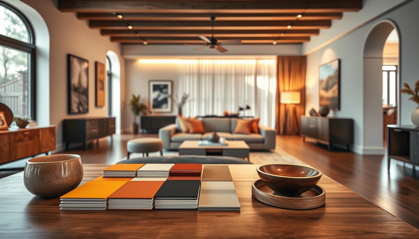
DIY Tips for Testing Color Schemes
Finding the right color scheme for your home is all about testing and validating your choices. With so many options for modern interior color schemes, a careful approach is key. This way, you can find the perfect colors for your space.
Paint Samples and Swatches
Paint samples and swatches are great for testing colors. Instead of painting a whole wall, start with small samples. This lets you see how colors look in different lights.
When picking paint samples, choose colors that match your desired interior trends. Apply them in various lighting spots, like near windows or under lamps. This helps you see how colors look at different times.
Visualizing Color in Different Lighting
Lighting changes how colors look in your home. To see your color scheme in different lights, try these tips:
- Watch how natural light changes your color samples throughout the day.
- Use lamps or overhead lights to see how artificial light affects your colors.
- Think about the color temperature of your bulbs. Warm white light can feel cozy, while cool white light makes colors pop.
Testing your colors in different lights ensures they look good all day. This is crucial for modern color schemes, as the right light can really make them shine.
Testing your colors before you decide can save you from expensive mistakes. By following these DIY tips, you can pick a color scheme that fits current trends and makes your home look great.
Finalizing Our Color Scheme Decisions
As we wrap up our color scheme journey, it’s key to think about the last steps. We need to decide if we should get professional help or do it ourselves. Choosing the right color scheme for our homes is crucial.
Expert Guidance vs. Personal Touch
Getting professional advice can be very helpful, mainly for big or complex spaces. Interior designers can give us specific tips on color schemes. They consider things like natural light and how rooms are used.
But, doing it ourselves lets us try out different colors. It helps us connect more with our home.
Reflecting Our Personality
Our color scheme should show who we are. We should think about our lifestyle, tastes, and the mood we want. This way, we pick a palette that makes our space better.
Whether we choose bold colors or something calm, it should feel right to us.

