
Did you know the right interior design color palette can make you feel better? The colors in your home’s interior affect the mood and feel of your space. At Moderno Interior, we know how crucial it is to pick the right shades to enhance your home’s style.
In this guide, we dive into color psychology, trends, and tips for picking the best colors for home interior design. Whether you want to update one room or your whole home, our guide has got you covered. It’s packed with knowledge and inspiration.
Key Takeaways
- Discover the impact of color psychology on your mood and energy levels
- Learn about the latest trends in interior design color palettes
- Get practical tips on choosing the perfect shades for your home
- Explore different interior design styles and their corresponding color schemes
- Find inspiration for your next home decor project
Understanding Color Psychology in Home Design
Choosing colors for our homes affects our mood and well-being. The colors around us can change our emotions, actions, and energy. It’s important to pick colors wisely for our mental health.
The Impact of Colors on Mood
Different colors can make us feel different ways. Warm colors like red and orange make us feel energized. Cool colors like blue and green calm us down. Knowing how colors affect us helps us create a supportive home environment.
For example, a bedroom should be a calm place. Using colors like light blue or pale green can make it peaceful. This helps us sleep better and stay asleep longer.
Key Colors and Their Associations
Some colors have meanings that guide our choices. For instance:
- Red is often linked with energy, passion, and excitement.
- Blue is usually associated with calmness, trust, and serenity.
- Green represents nature, growth, and harmony.
- Yellow is often connected with happiness, optimism, and warmth.
Knowing these meanings helps us choose colors that reflect our personalities and support our well-being. It’s key to pick colors that are both stylish and functional.
When picking colors for our homes, it’s crucial to look at popular interior color trends and interior color ideas for bedrooms. This ensures our choices are both fashionable and practical.
Popular Color Trends for 2023
This year, we’re seeing a comeback of earthy tones and a bold new approach to home colors. The latest trends show 2023 is all about mixing natural hues with bold statement pieces.
Earthy Tones and Natural Hues
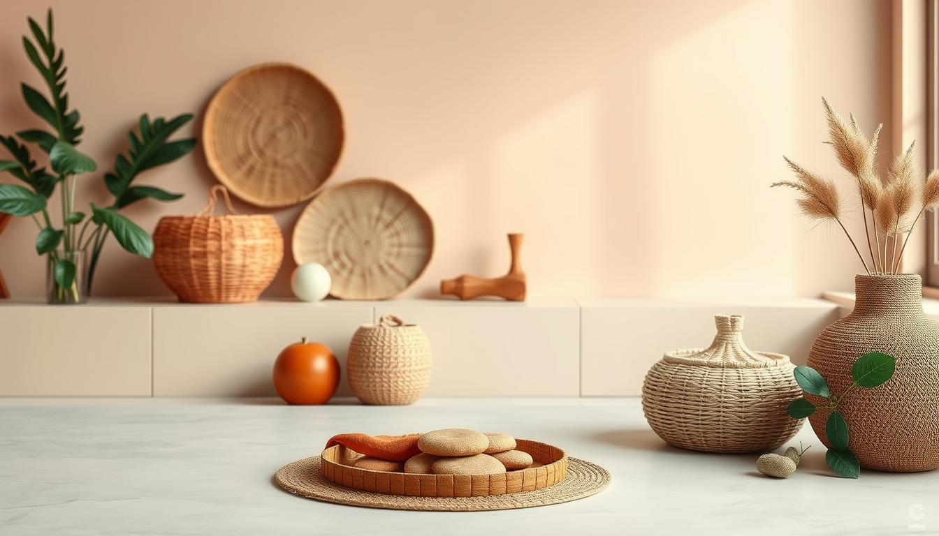
Earthy tones are back in 2023. These natural colors add warmth and coziness to homes, making them feel welcoming. Some key earthy tones include:
- Sage Green: A soft, muted green that brings nature into any room.
- Terracotta: A warm, earthy red that adds coziness and depth.
- Sand: A light, airy beige that brings calm and serenity.
These colors are pleasing to the eye and promote well-being and a connection to nature.
Bold Colors Making a Comeback
Bold colors are also trending in 2023. These vibrant hues add personality and energy to homes. Some bold colors making a comeback include:
- Deep Blues: Rich, navy blues that add sophistication and drama.
- Emerald Greens: Vibrant, energetic greens that make a statement.
- Corals: Warm, inviting oranges that add a pop of color and warmth.
These bold colors can be used as accent walls, furniture, or accessories. They add a bold touch to your home.
In conclusion, 2023 is an exciting year for home interior colors. It’s a mix of earthy tones and bold colors. By using these trends, you can create a welcoming and stylish space.
Choosing the Right Color Palette
A well-chosen color palette is key to a stunning home interior design. When picking paint colors for your home, it’s not just about your favorites. It’s about creating a harmonious look in all your living spaces.
One big challenge is harmonizing colors for different rooms. Each room has its own purpose and feel. The color palette should match this. For example, paint colors for the living room should be welcoming. Bedrooms need calming colors.
Harmonizing Colors for Different Rooms
To achieve harmony, consider these tips:
- Choose a core color and use its variations in different rooms.
- Find a unifying element, like a specific shade or texture, for your home.
- Think about how colors flow from one room to another.
For instance, if you pick a bold color for your living room, use it lightly in other rooms. This creates a sense of continuity.
Creating a Cohesive Look Throughout
Creating a cohesive look is more than using the same color everywhere. It’s about making a visual flow that connects your spaces. Here are some strategies:
- Choose a main color and use it consistently, changing its shade or tone in different rooms.
- Start with neutral colors and add color with decor and accessories.
- Follow the 60-30-10 rule: 60% of a dominant color, 30% of a secondary color, and 10% of an accent color.
By carefully choosing paint colors for your home and thinking about how they work together, you can make a beautiful, cohesive interior. It will feel welcoming and stylish.
The Role of Light in Color Selection
Light, whether from the sun or artificial sources, greatly affects how we see colors in our homes. The same color can look very different under different lights. So, it’s key to think about lighting when picking colors for your home interior.
Natural Light vs. Artificial Light
Natural light and artificial light change how colors look. Natural light, with its full spectrum, is often the most accurate. But, its intensity and color can change a lot during the day and in different rooms.
Artificial lighting, like incandescent, fluorescent, and LED, also affects color. Warm-toned lights make colors seem yellow or red. Cool-toned lights make them seem bluer.
Testing Colors in Your Space
To make sure your colors look good in all lights, test them in your home. Paint small swatches on walls and see how they look at different times and under different lights.
Use paint samples or color cards for a better view of the color. Also, check how the color looks at night with your artificial lights on. This will show you how it will look in your home.
By thinking about how light affects your interior design color palette, you can choose colors that make your home look beautiful and balanced.
Neutral Colors: Timeless and Versatile
Neutral colors have always been a key part of home decor. They bring timeless elegance and are always in style. These colors work well with many decorating styles, from modern to traditional.
“Neutral colors are the foundation upon which great design is built,” says a renowned interior designer. They create a clean and serene atmosphere. This makes it easy to add accent pieces and artwork.
Best Shades of White and Beige
White and beige are top picks for neutral colors. They make rooms look larger and brighter. For example, soft white on walls and trim creates a cohesive look. Beige adds warmth without being too bold.
Some of the best shades include:
- Soft whites with a hint of cream
- Beige tones with a slight undertone of gray or taupe
- Light grays that can serve as a neutral background
Incorporating Neutrals with Accents
Neutral colors make it easy to add accent colors. You can use bold or bright colors in furniture, rugs, or decor. This adds depth and interest to a room.
For instance, a neutral living room can get a boost from a vibrant red armchair or colorful artwork. This way, you can change your decor without repainting the whole room.
Design experts say, “The key to using neutrals with accents is balance. You want to make sure your accent colors enhance the space without overwhelming it.”
To find this balance, try the 60-30-10 rule. Use 60% of the room for a dominant neutral color, 30% for a secondary color, and 10% for an accent color. This rule helps create a harmonious and appealing space.
Warm Colors: Inviting and Cozy
Warm colors can turn our homes into cozy havens. They make rooms feel welcoming, comfy, and snug. This is great for unwinding after a long day. We’ll look at the top warm colors and how to use them in your home.
Popular Warm Color Choices
Warm colors like reds, oranges, and yellows are lively and cozy. They bring warmth and comfort. Here are some favorite warm colors:
- Terracotta: A warm, earthy red that makes any room cozy.
- Golden Yellow: Bright and cheerful, it brings a sunny vibe.
- Soft Orange: A mix of red and yellow, it’s warm and inviting.
You can use these colors in many ways. Try them on walls, furniture, and decor for a warm look in your home.

Where to Use Warm Colors Effectively
Warm colors work well in different rooms for different looks. Here are some ideas:
- Living Rooms: Warm colors on walls or furniture make a cozy spot for gatherings.
- Bedrooms: Soft warm tones help you relax and sleep better, making them perfect for bedrooms.
- Dining Areas: Warm colors can make you hungry and create a friendly vibe for meals.
When using warm colors, balance them with neutral tones to avoid too much. Interior design experts say the goal is a mix that’s both functional and beautiful, following the latest trends.
Cool Colors: Calming and Refreshing
Cool colors can change your mood and make your home feel like a calm oasis. When picking paint colors, cool tones are great for a peaceful vibe.
Shades of Blue and Green
Blues and greens are top cool colors, offering many shades for a calm space. You can choose from light sky blues to deep navy, and from soft mint greens to rich forest greens.
- Soft Blues: Perfect for bedrooms and bathrooms, soft blues help you relax.
- Deep Blues: Adding elegance, deep blues are ideal for living rooms and dining areas.
- Mint Greens: Fresh and soothing, mint greens are excellent for kitchens and nurseries.
- Forest Greens: Warm and rich, forest greens add coziness to any room.
Ideal Spaces for Cool Colors
Cool colors work well in different rooms, depending on the look you want. They’re best in rooms with lots of natural light, as they reflect light and make rooms seem bigger.
Some great places for cool colors are:
- Bedrooms, for a calming feel.
- Bathrooms, to make them feel clean.
- Living rooms, for a sense of openness.
Using cool colors in your home design keeps you in line with current color trends for home interiors. It also makes your space feel fresh and calming.
Accent Walls: Adding a Pop of Color
An accent wall can change how a room looks, making it more lively. It’s not just a design choice; it’s a bold statement that can change a room’s feel.
Choosing the right wall for an accent is key. It depends on the room’s layout and the look you want. For example, the wall behind a sofa in a living room is often a good choice. In bedrooms, the wall behind the bed can be a stunning focal point.
Choosing the Right Wall for Accents
Picking the perfect wall for an accent involves looking at the room’s design and your taste. Here are some tips:
- Find the room’s natural focal point and highlight it.
- Think about the wall’s visibility when you enter the room.
- Consider how you use the room and its function.
As interior design experts say, balance is crucial for a great accent wall. You want it to be noticeable but not too much.
Techniques for Creating Accent Walls
There are many ways to make an accent wall, from simple painting to complex designs. Some popular methods include:
- Painting the wall a bold, contrasting color.
- Adding textures with materials like wood, stone, or wallpaper.
- Creating a gallery wall with frames of different sizes and shapes.
“The right accent wall can turn an ordinary room into an extraordinary one.” This quote shows why interior designers love accent walls. They know how a well-designed accent wall can make a room look better.
For example, a room with a neutral color scheme can get a big boost from a bold, red accent wall. It makes the room more lively and welcoming.
The success of an accent wall comes down to its execution. By picking the right wall and method, you can add color that makes your home look better and more personal.
Color Combinations to Consider
Choosing the right colors is key to a great home look. It’s all about picking colors that work well together. This creates a space that’s both harmonious and stylish.
Exploring color combinations means understanding what makes a palette pop. Using complementary colors is a smart move. These colors are opposite each other on the color wheel. They create a bold contrast that adds depth and interest.
Complementary Colors for Contrast
Complementary colors offer the highest contrast. This makes each color appear brighter. Think blue and orange, red and green, or yellow and purple. These combos add a lively touch to your home.
For example, a bold blue with orange accents can make a living room lively. Red and green together add a festive vibe, perfect for holidays.

Trendy Color Pairings for Modern Spaces
There are also trendy color pairings for a modern look. These include monochromatic schemes, analogous colors, and triadic color schemes.
A monochromatic scheme uses different shades of one color for a cohesive look. Analogous colors are next to each other on the color wheel, creating a smooth transition. A triadic color scheme uses three colors spaced equally apart for a balanced palette.
Some trendy pairings include:
- Soft peach and muted gray for a warm feel.
- Navy blue and crisp white for a classic look.
- Mint green and blush pink for a soft, feminine vibe.
By exploring these color combinations, you can create a unique and captivating home. It will reflect your personal style perfectly.
The Importance of Test Swatches
Choosing the right colors for your home is key. Testing colors with swatches is essential. It makes sure the colors look good in your lighting and on your surfaces.
How to Properly Test Colors
To test colors right, start with swatches or sample paints. Apply these swatches to different walls in the room. This is because colors can change on various surfaces and under different lights.
- Choose a variety of surfaces to test the color, including trim, walls, and ceilings.
- Observe the color at different times of day to see how it changes with natural light.
- Consider the color of adjacent rooms and how they might affect the perception of the color you’re testing.
Evaluating Colors Under Different Lighting
It’s vital to check colors under different lights. Lighting can change how a color looks a lot. Natural light, artificial light, and the time of day all play a part.
To evaluate colors well:
- Test the color during the day and at night with artificial lighting.
- Observe how the color looks from different angles and in different parts of the room.
- Consider using color-testing apps or tools that can help simulate different lighting conditions.
By testing colors with swatches and checking them under various lights, you can make smart choices. This ensures your home’s colors match the latest color trends for home interiors and improve your space.
Color Trends Across Different Styles
Knowing the color trends for various interior styles is key to good design choices. Each style has its own color trends and preferences.
Modern vs. Traditional Color Choices
Modern design favors a clean, minimalist look with neutral tones like whites, grays, and blacks. Traditional interiors, on the other hand, go for richer, warmer colors like deep reds, blues, and golden yellows. Think about your home’s style and your taste when choosing between modern and traditional colors.
| Style | Typical Colors | Key Features |
|---|---|---|
| Modern | Neutrals (whites, grays, blacks) | Clean lines, minimalist aesthetic |
| Traditional | Rich colors (deep reds, blues, golden yellows) | Classic furniture, ornate details |
Eclectic Color Schemes
Eclectic interiors let you play with colors. You can mix bold, vibrant colors with softer tones for a unique look. The trick is to balance these colors and textures well.
For an eclectic home, pick colors that match your desired look. Feel free to try out different colors and mixes. The goal is to make a space that shows off your personality and style.
Understanding color trends for different styles helps you choose the right colors for your home. Whether you prefer modern simplicity, traditional charm, or eclectic flair, the right colors can make your space beautiful and functional.
Tips for Updating Your Home’s Colors
Updating your home’s colors can make a big difference. It’s a simple way to give your space a fresh look. When picking paint colors for your living room, think about what colors will match your furniture and decor.
Refreshing a Room with Minimal Effort
One easy way to change your home’s colors is by adding new accent pieces. Try throw pillows, blankets, or vases in a bold color. This adds a splash of color without needing to paint the whole room.
Seasonal Color Changes
Changing your home’s colors with the seasons can keep it feeling new. Use warmer colors in winter and cooler ones in summer. You can do this with seasonal decor, throw blankets, or even a new paint color.

